Sites that do the work.
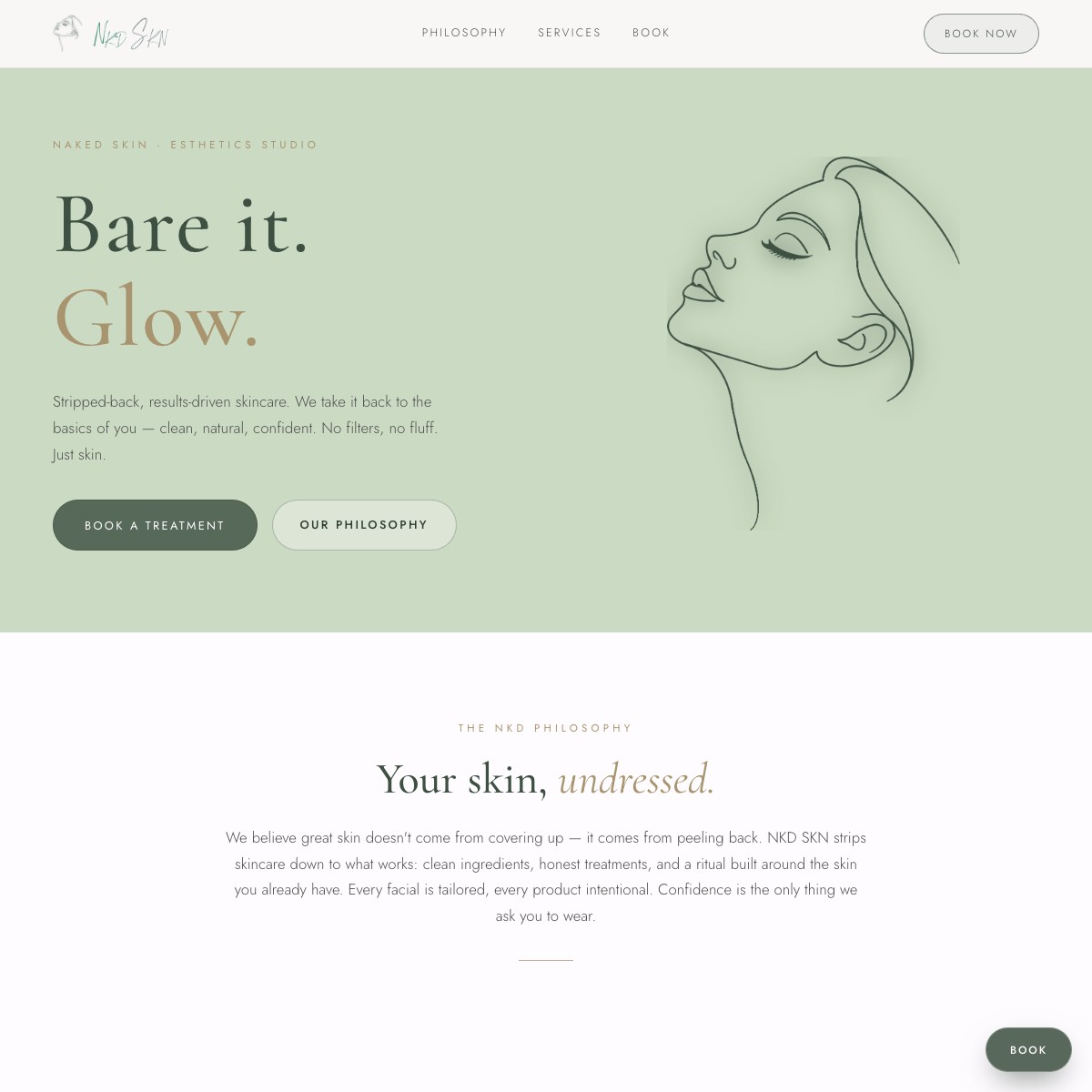
Naked-skin esthetics studio site. Sage, forest-green, and nude-beige palette, single-line face illustration, and an integrated booking flow. Premium, botanical, confident. Bare it. Glow.
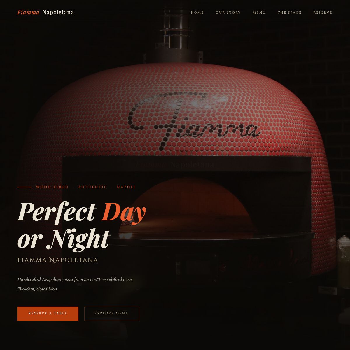
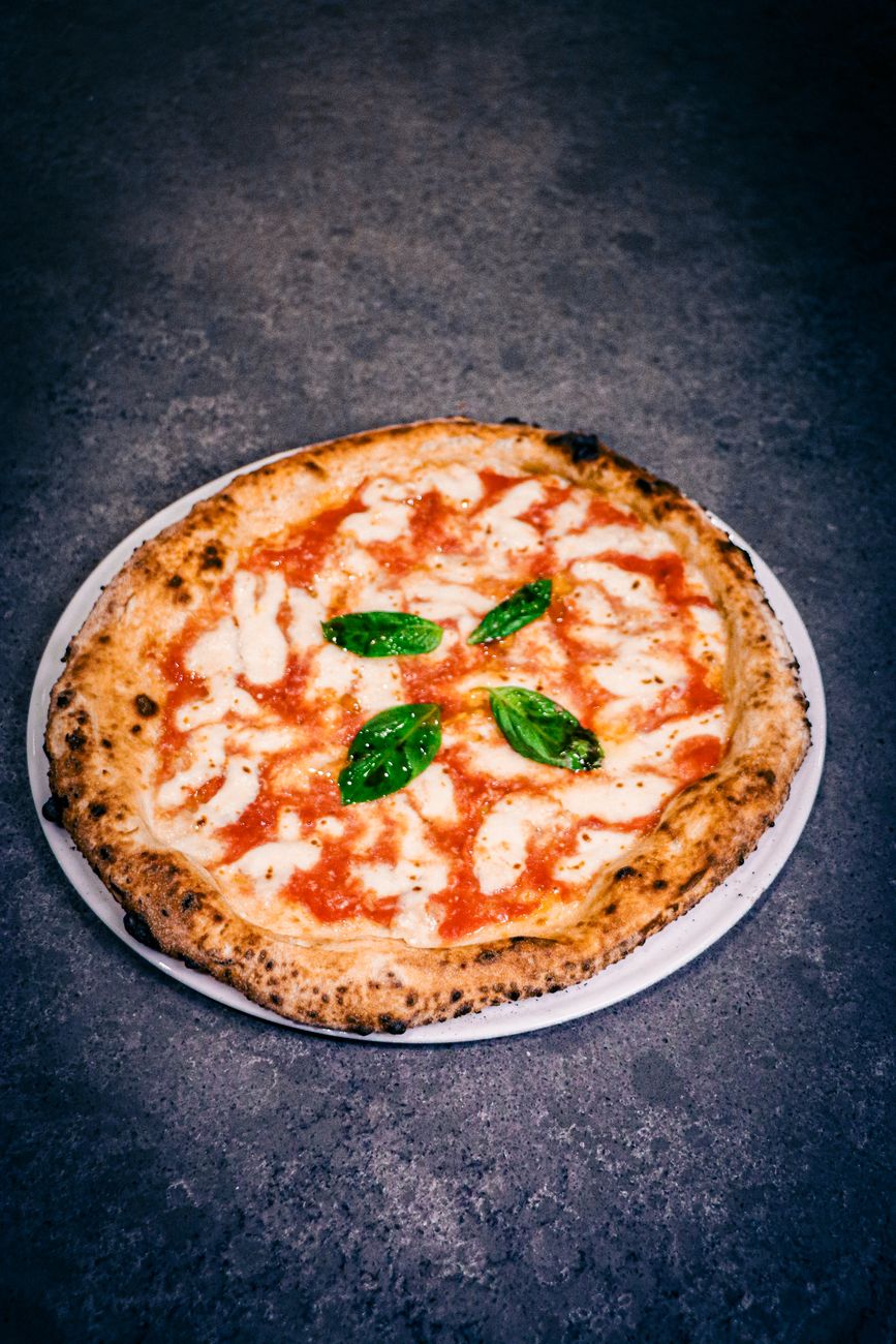
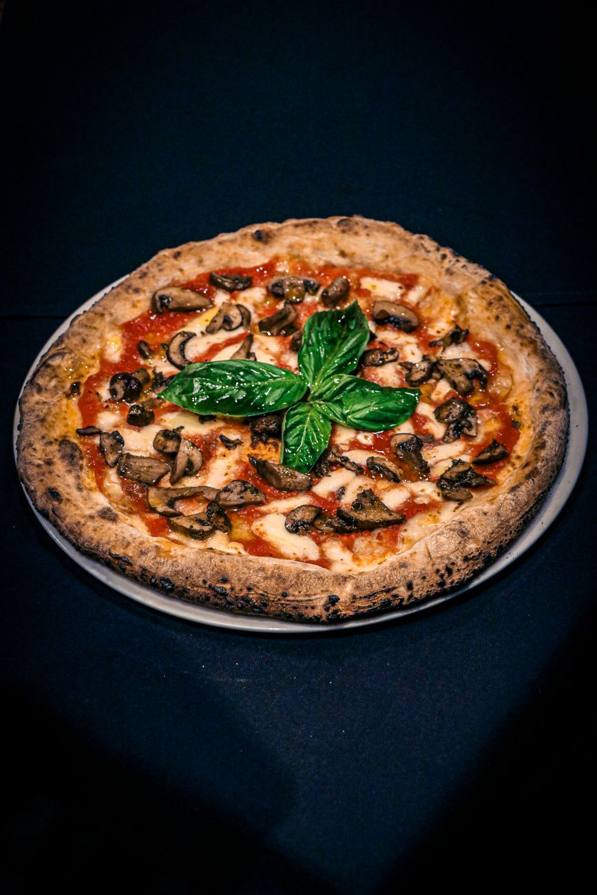
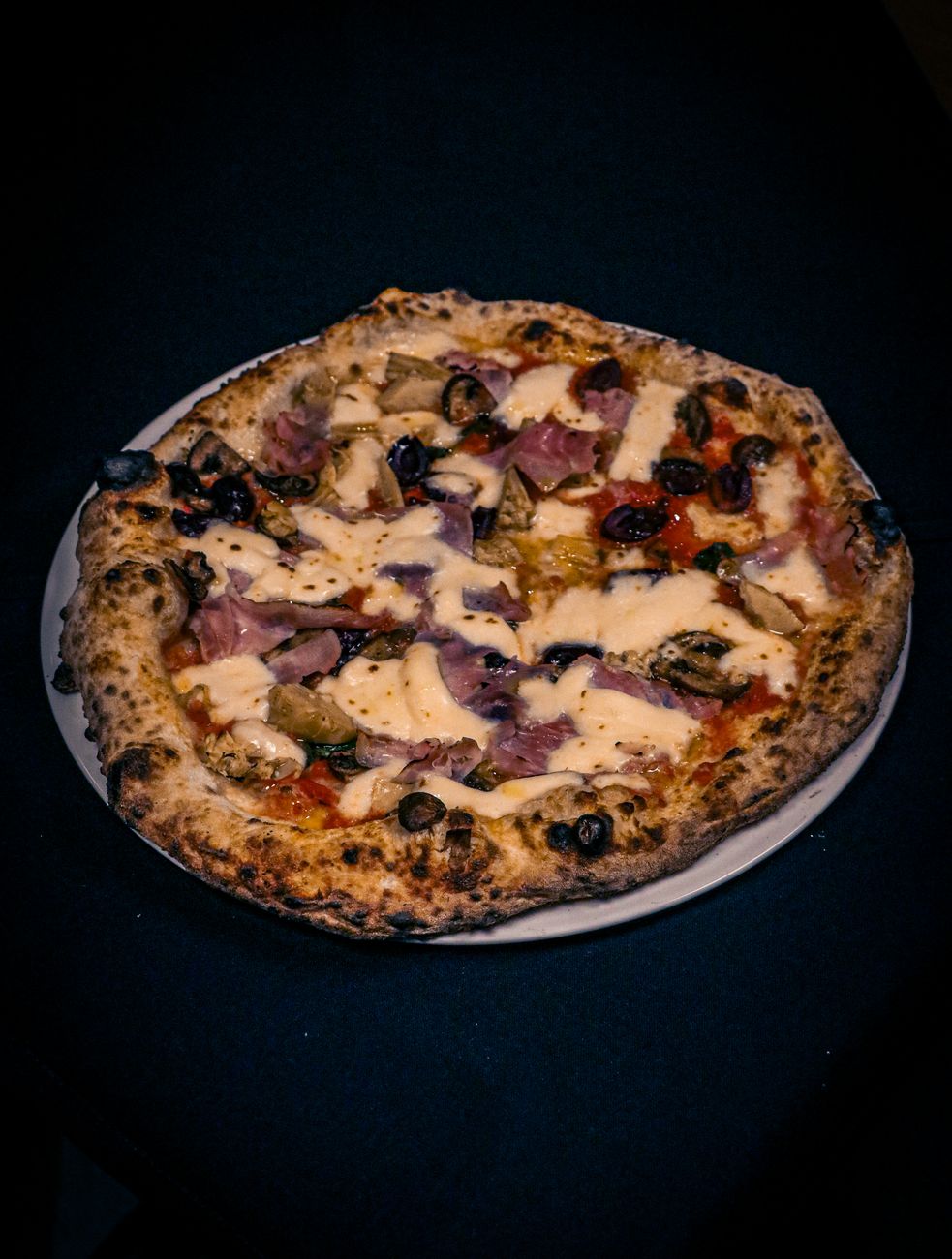
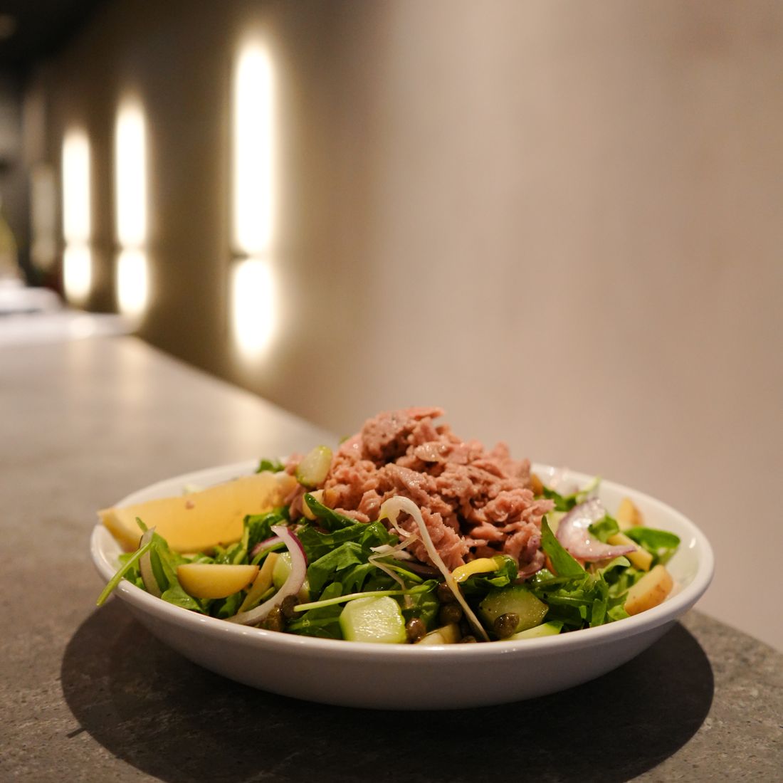
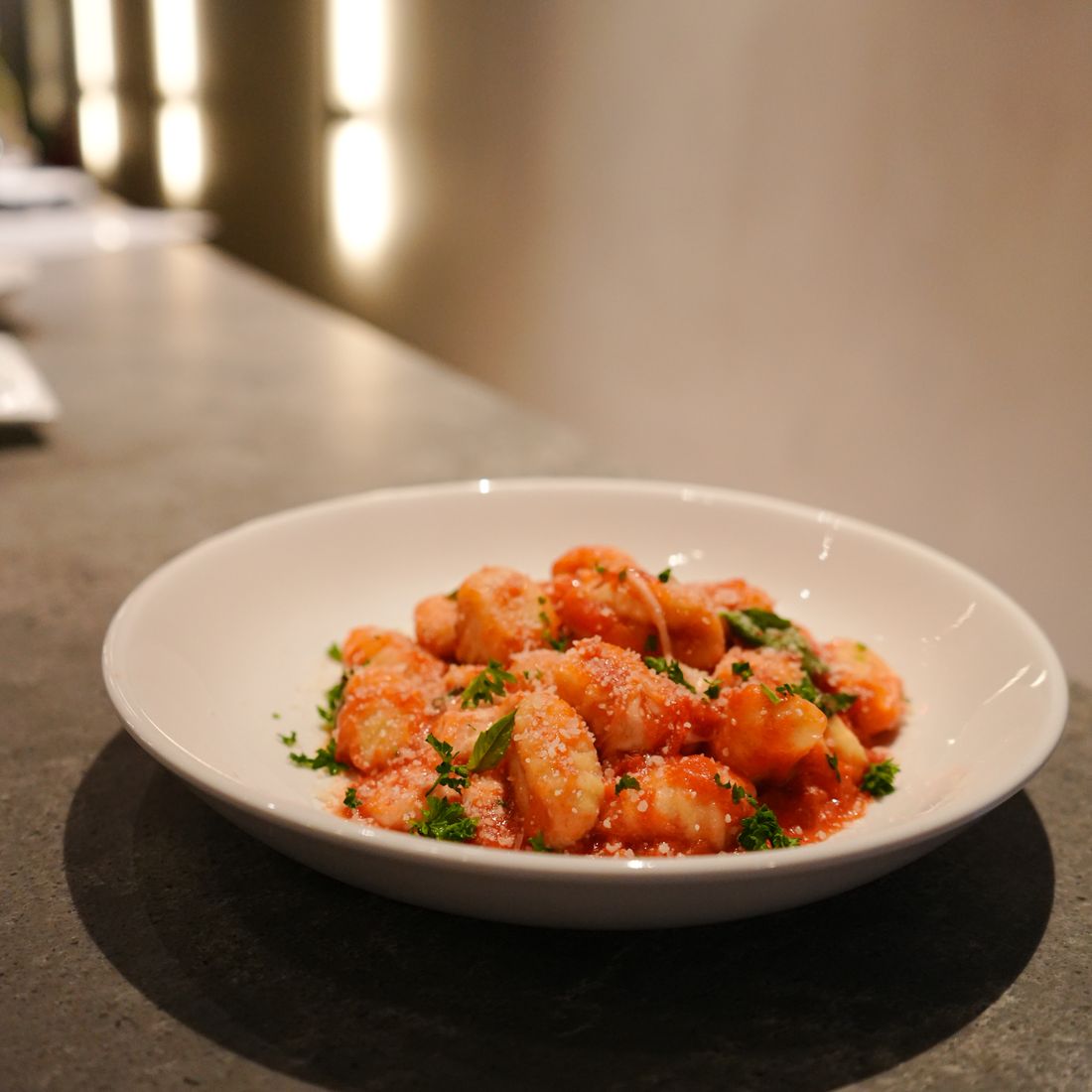
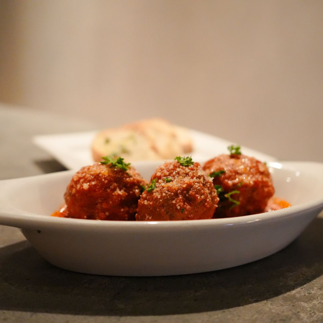
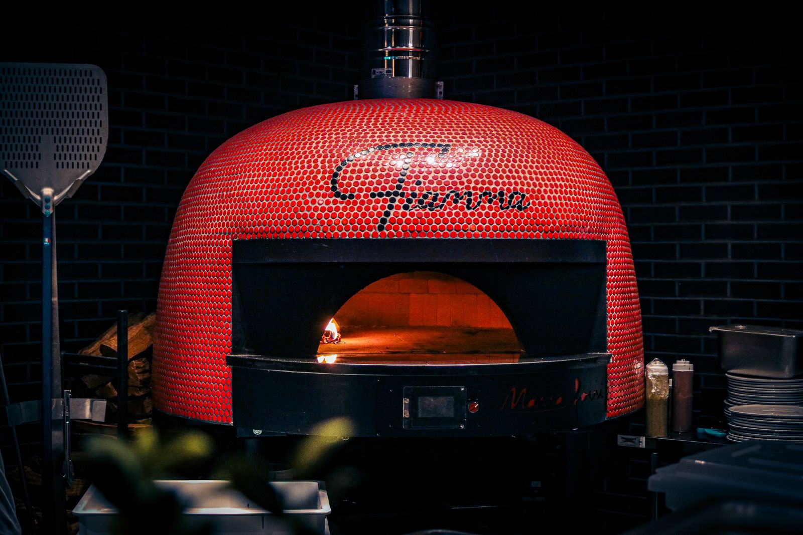
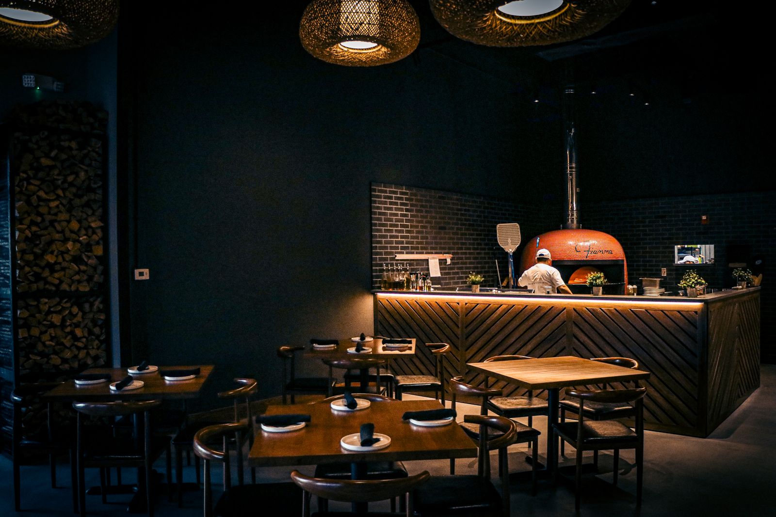
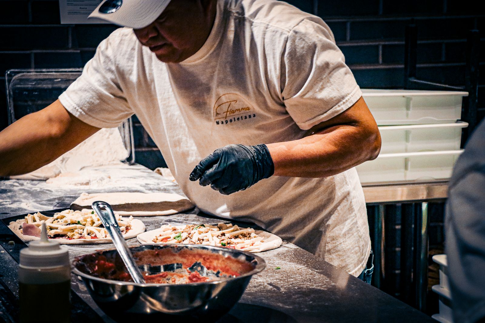
Editorial photography for a wood-fired Neapolitan pizzeria: 524 frames capturing the 800°F oven, the dough work, and the dining room. Visual story anchored on the red mosaic centerpiece that defines the room.
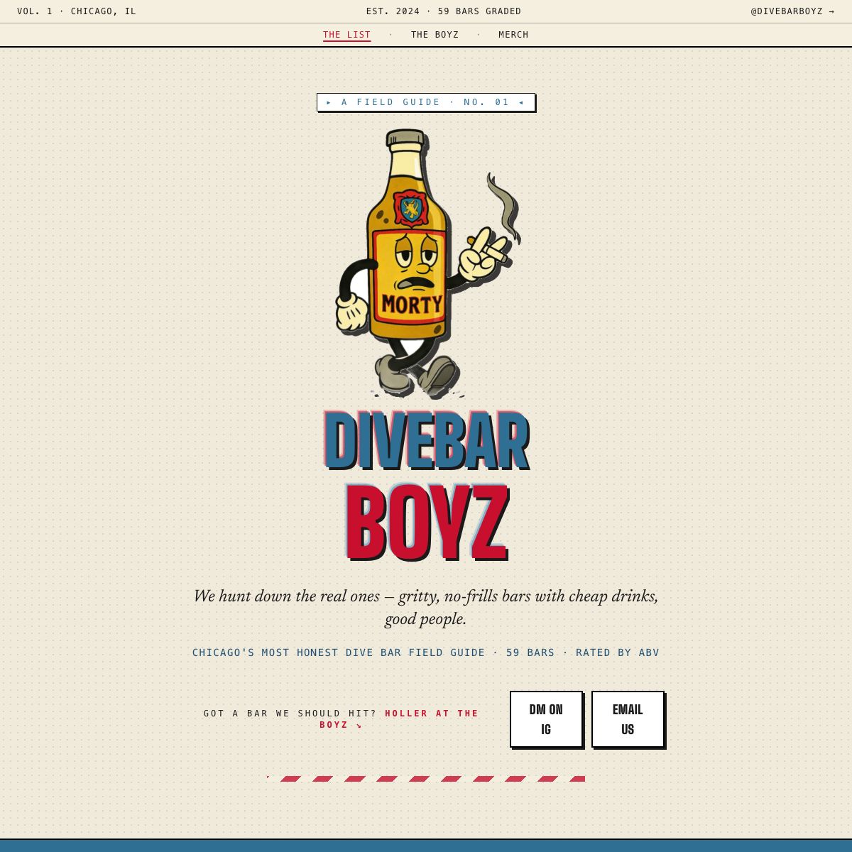
An editorial field guide to Chicago dive bars. 58 spots graded by the people who actually drink there. Morty the bottle mascot, Chicago flag palette, and a Wanderlog-backed map under the hood.
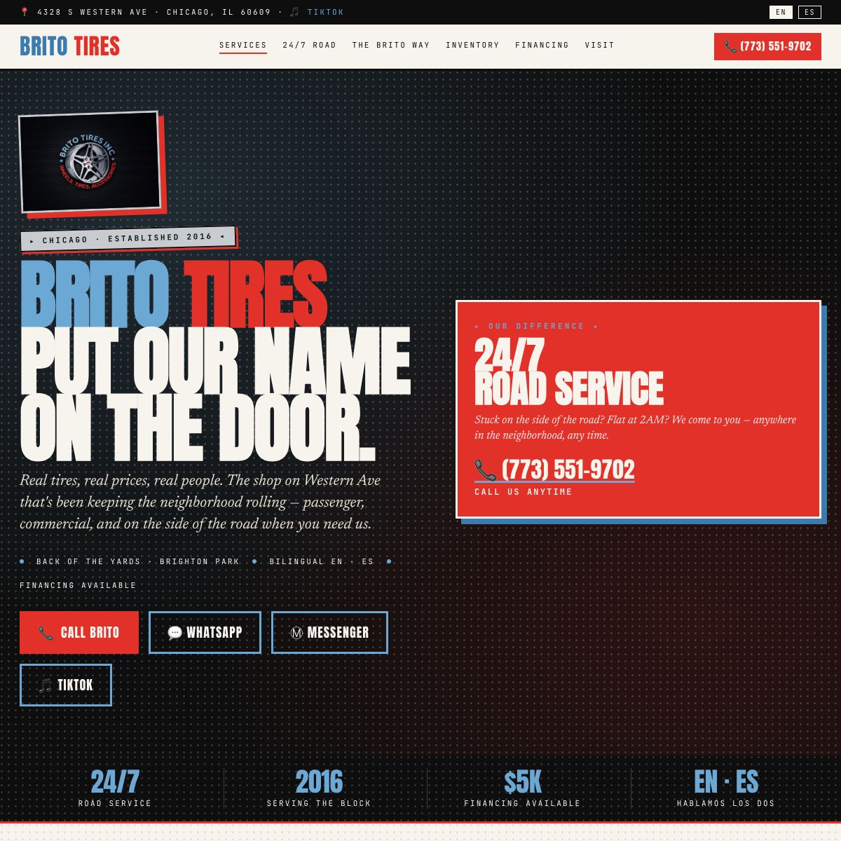
Bilingual EN/ES single-page site for an independent Chicago tire shop. 24/7 mobile service, editorial layout, real photography. Built to convert phone calls in two languages.
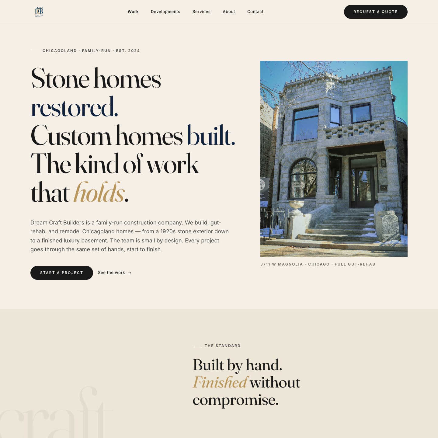
Editorial site for a family-run Chicagoland construction company. Stone homes restored, custom homes built. Full-bleed project photography and an italic payoff line. The kind of work that holds.
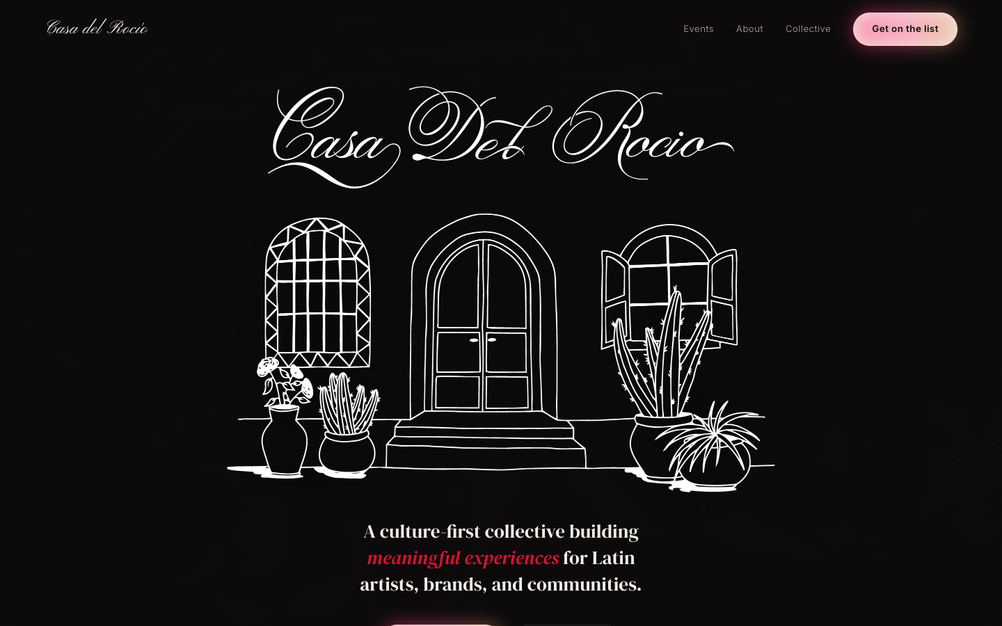
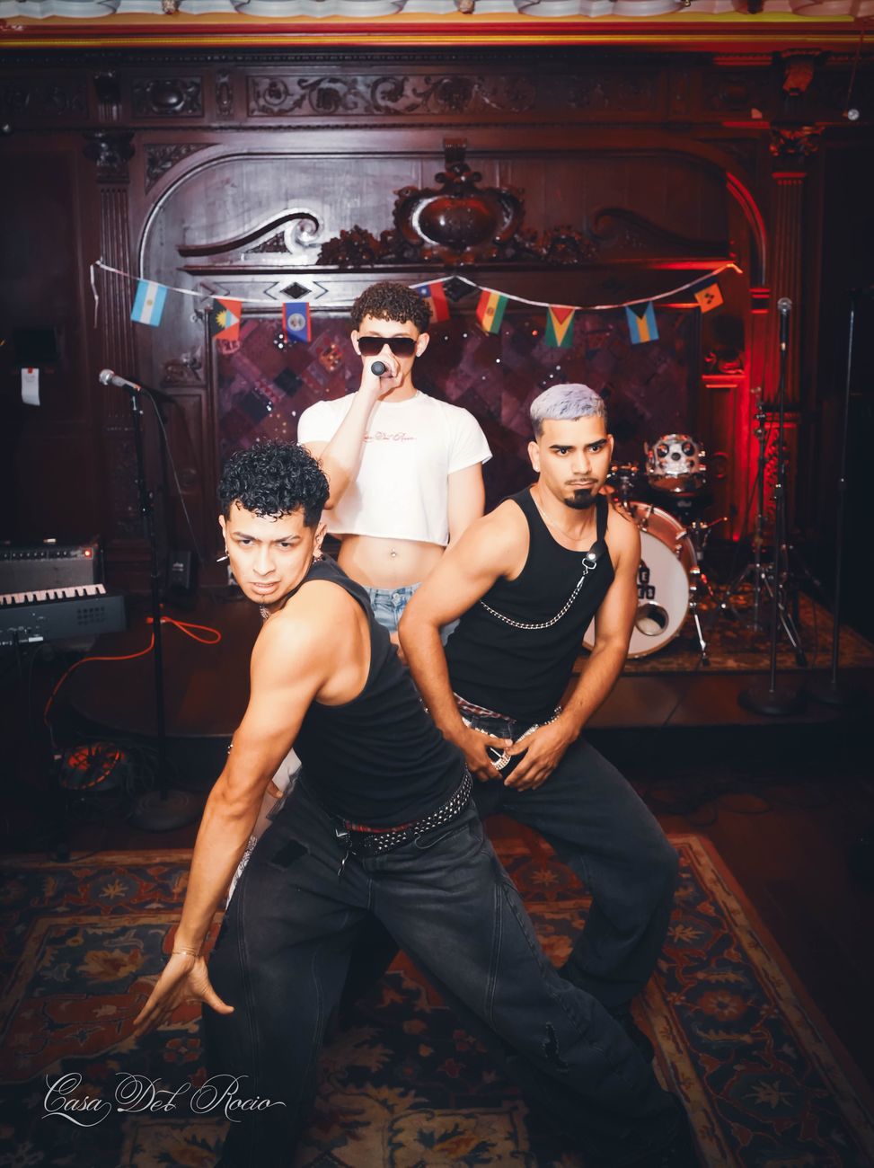
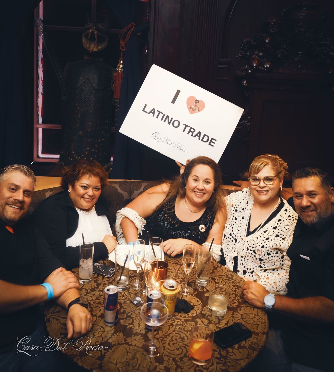
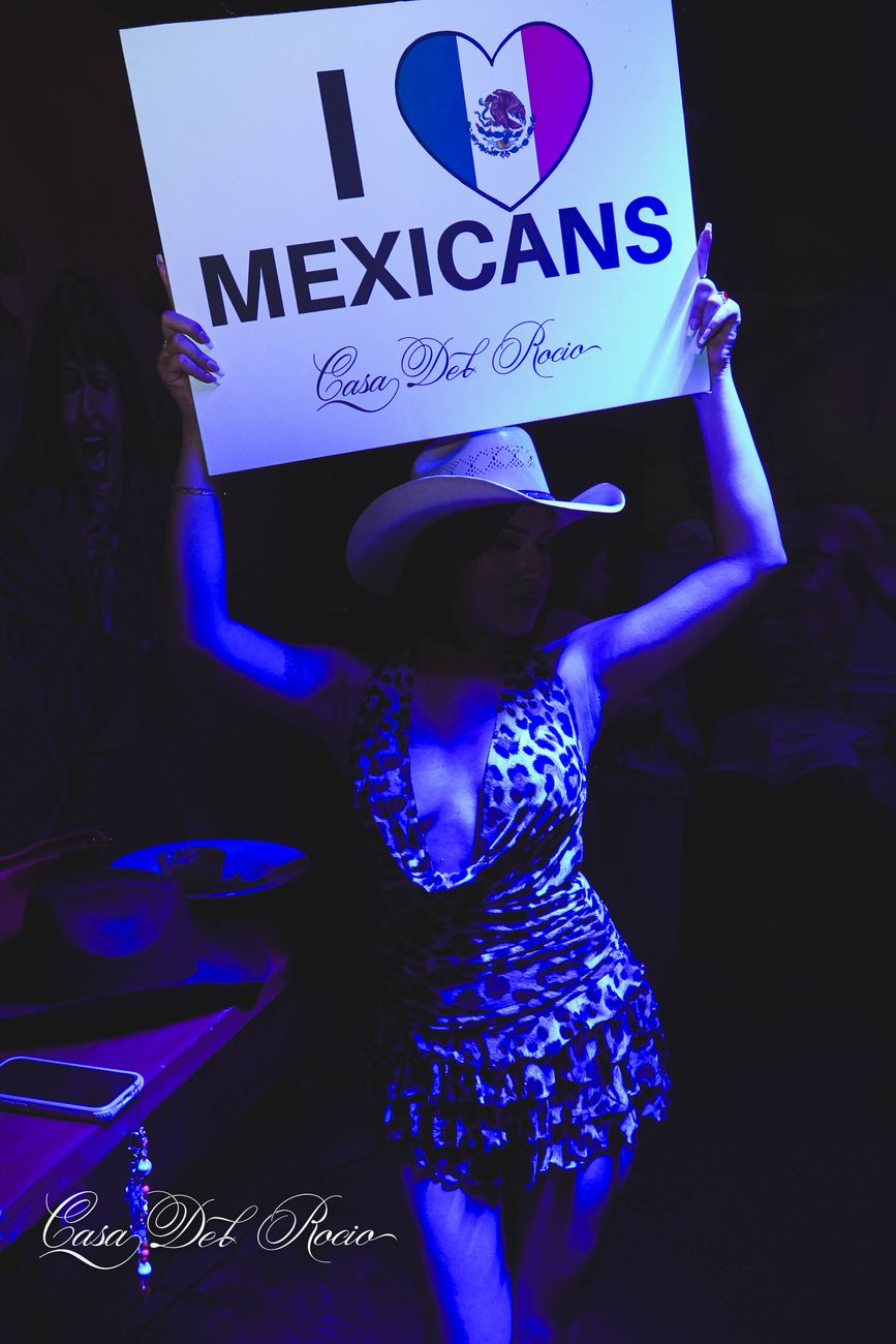
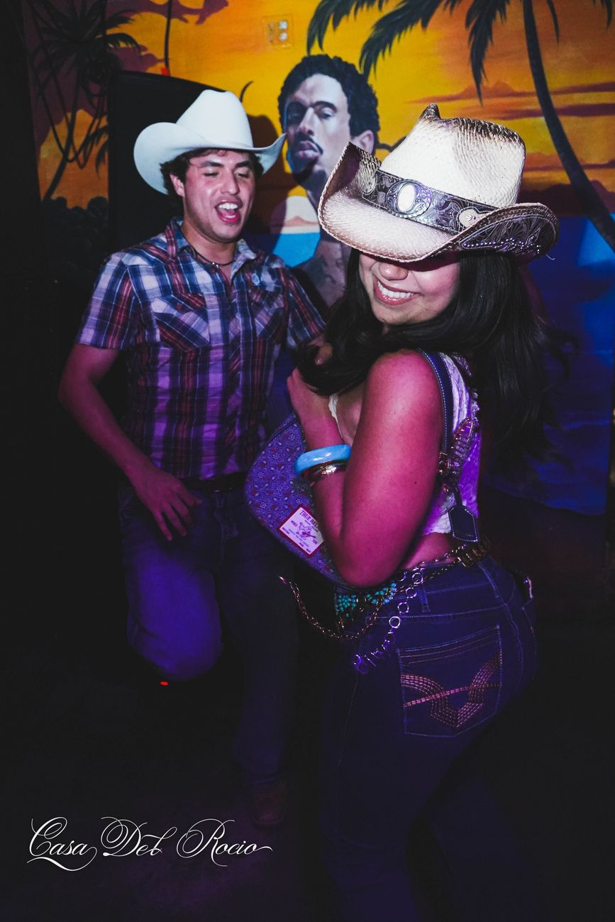
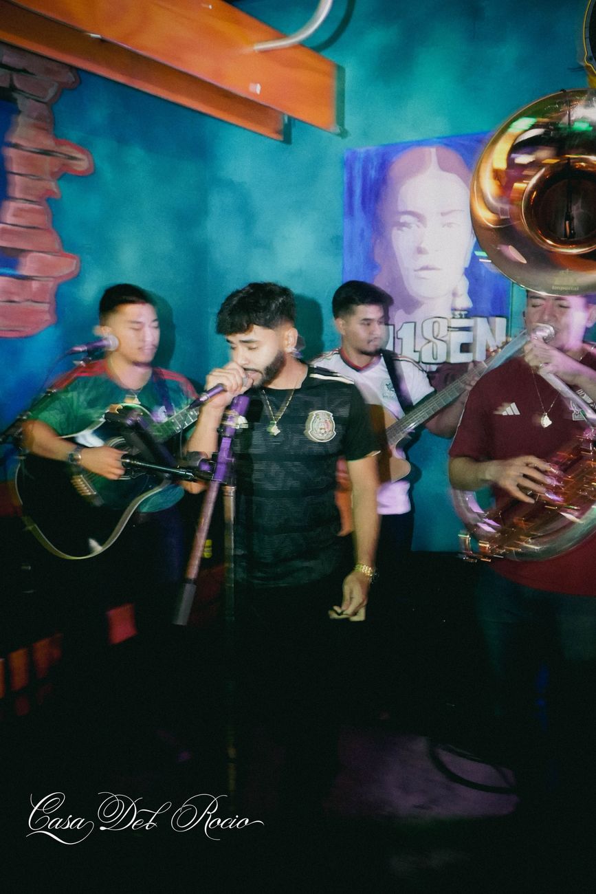
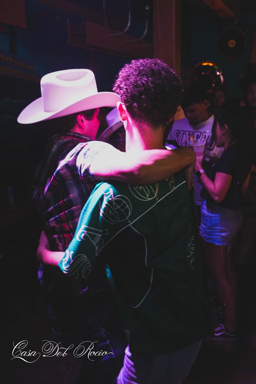
A culture-first collective building meaningful experiences for Latin artists, brands, and communities. Line-art facade hero, event drops, and a members RSVP flow. Culture first.
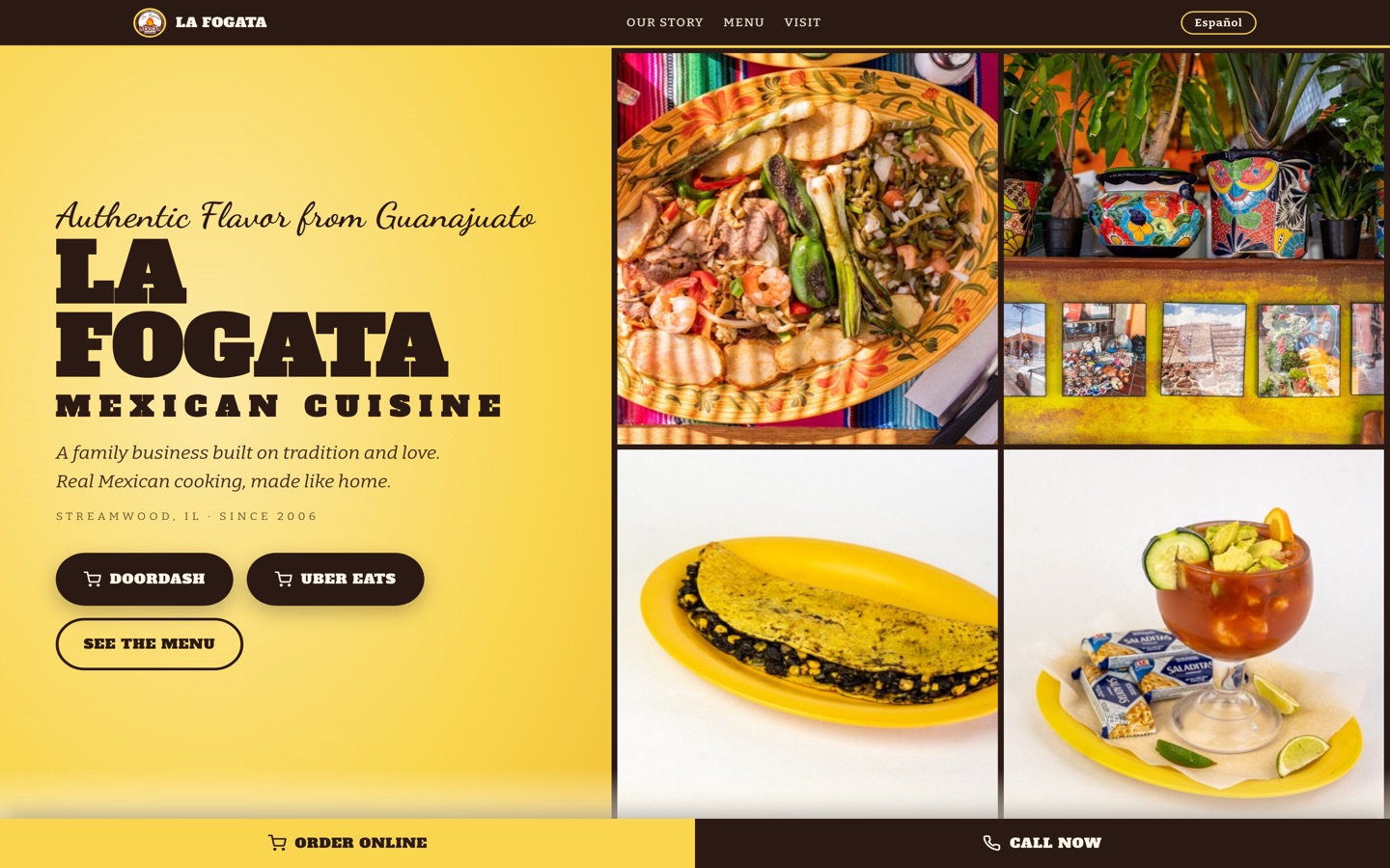
Family recipes over mesquite fire, built for a bilingual room. Full ES/EN toggle across every page, a menu condensed to price tiers, one-tap ordering and calling, and a link-in-bio page with day-aware specials. Authentic flavor from Guanajuato.
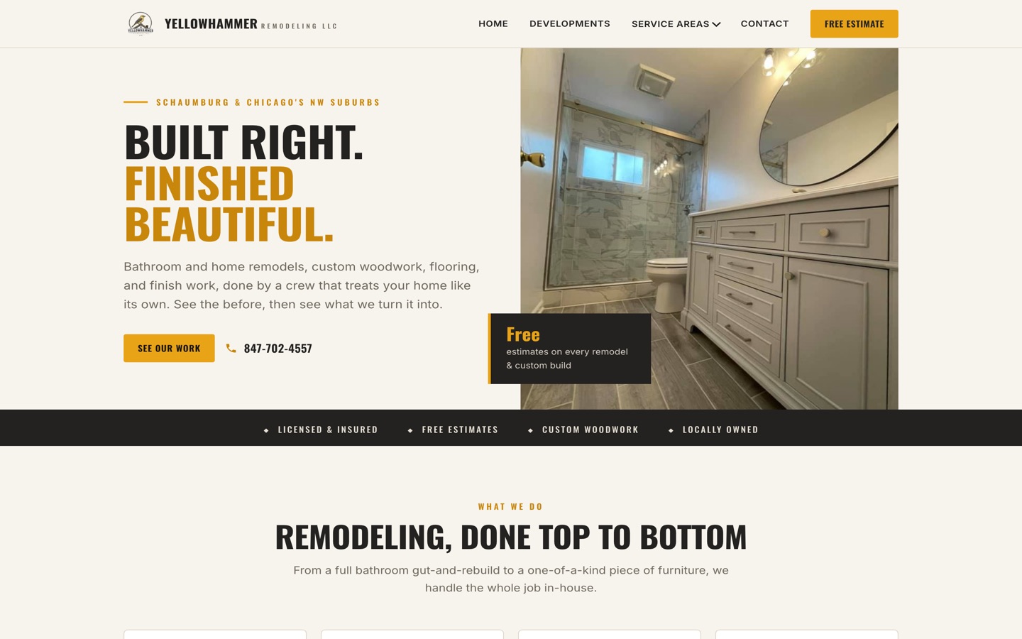
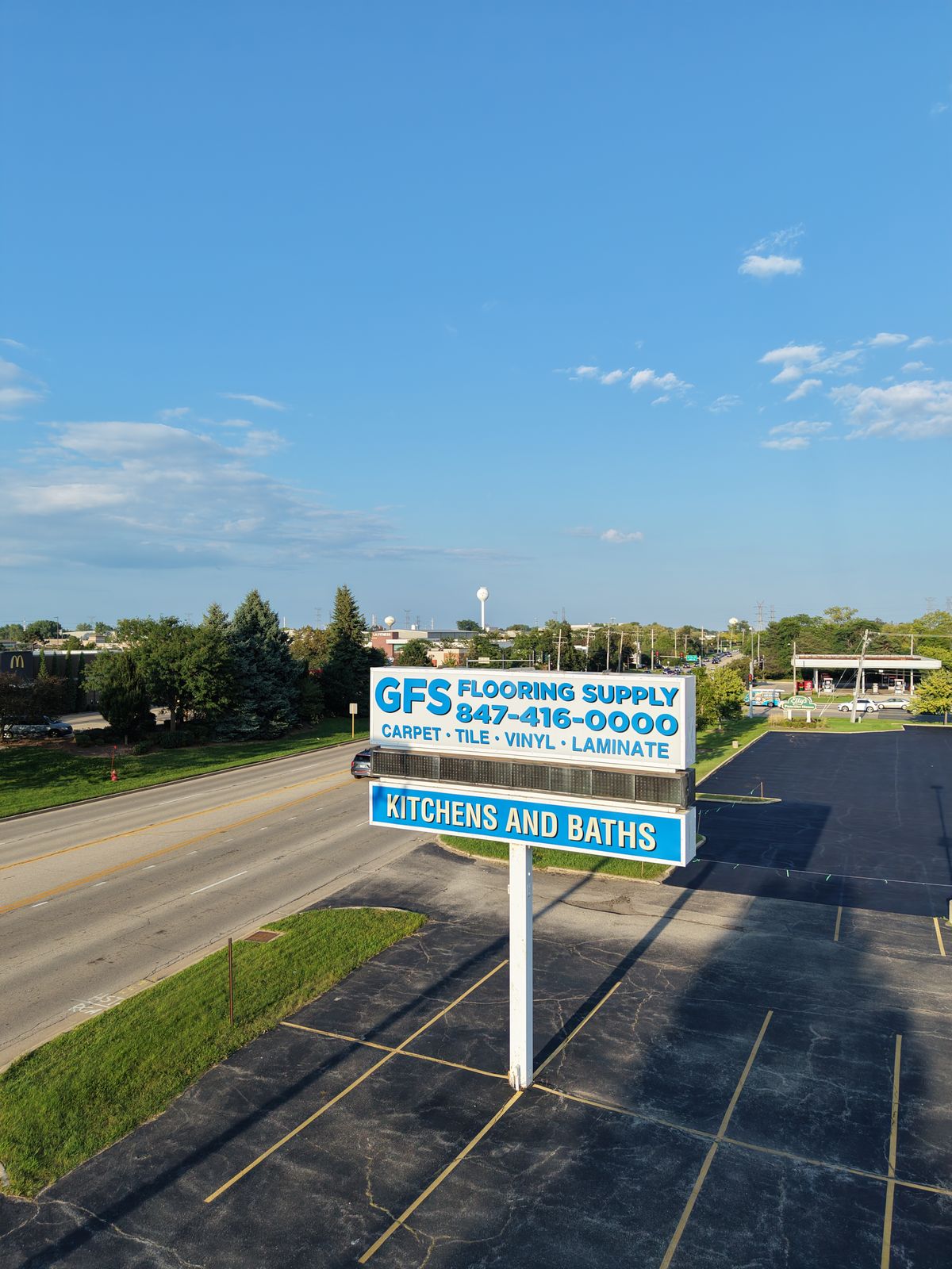
Bathroom gut-and-rebuilds, flooring, and live-edge custom furniture. Before-and-after proof front and center, plus a lead form wired to an owner dashboard so every estimate request lands somewhere Bob actually checks. Built right. Finished beautiful.
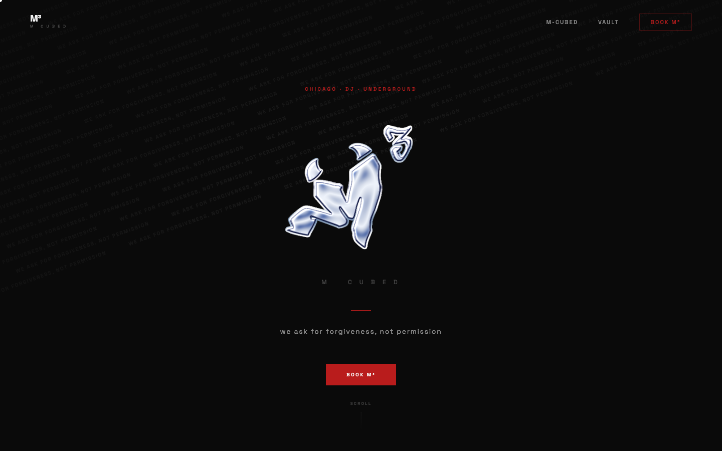
Dark, chrome-mark site for an underground Chicago DJ. Full-bleed black canvas, liquid-chrome logo, booking flow, and a members-only vault. Voice-locked to the persona. We ask for forgiveness, not permission.